Look data from the Iraq war!
|
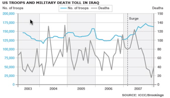
Finally, there is something besides rhetoric published about the Iraq war. The graph on the left comes from the BBC. (Because British people are smarter) This graph shows that the surge was actually quite modest and that there was a drastic drop in military deaths during the time the surge was going on. While correlation is not causality - meaning that it is not shown at all from this graph that the surge was responsible for the drop in deaths (although that is clearly implied.) It is nice to see some hard data to actually reason about. The reason why the surge might not have anything to do with the drop in deaths is because a cease fire from one of the militia armies (I am not an expert) has widely been attributed as being behind the drop in violence rather than the surge |
(Musings) Permanent Link made 4:43 PM | TrackBacks (0)
Actually I think the Brookings Institute is an American outfit, not British. But at least the BBC published it.
Posted by: Nate at April 14, 2008 4:33 AM